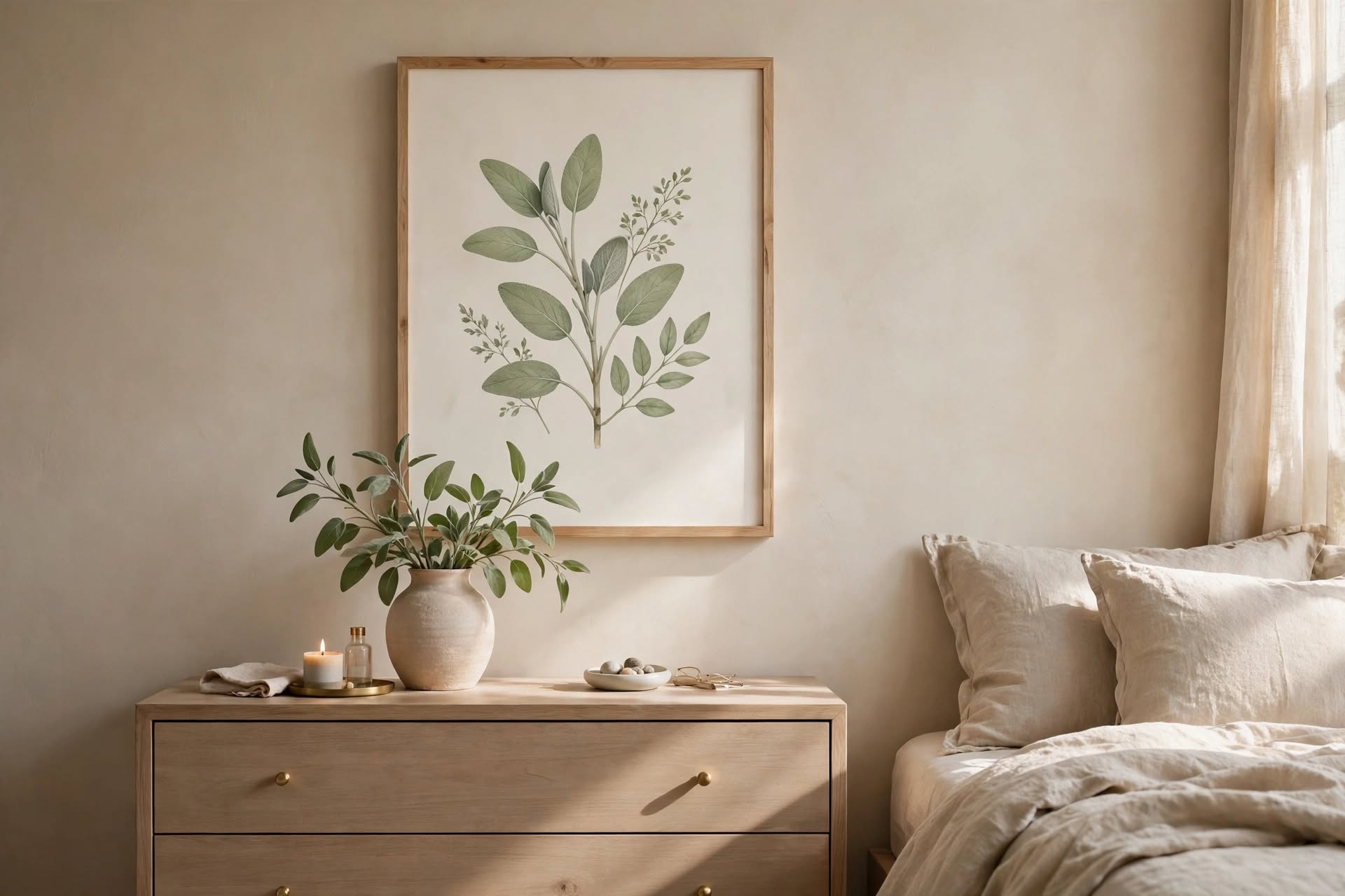
You do not hang this art to be noticed. You hang it so that, one Tuesday at 4:17 PM, the light hits the frame and something in your chest finally exhales.
That is the quiet luxury approach to wall art. It is not about filling every empty wall, collecting expensive names, or turning your living room into a showroom. It is about choosing pieces that make a room feel considered, balanced, and quietly beautiful.
Think soft textures instead of shiny finishes. Muted colors instead of dramatic contrasts. A single oversized canvas instead of a dozen small decorations competing for attention.
The best part? Creating this look does not require an unlimited budget. With the right proportions, thoughtful materials, and a restrained color palette, even affordable artwork can feel timeless.
In this guide, you will find five quiet luxury wall art ideas, three color palettes, practical arrangement tips, and advice on choosing artwork for different rooms and wall sizes.
What Makes Wall Art Look Quietly Luxurious?
Quiet luxury is less about a particular style of painting and more about how artwork relates to the rest of the room.
A piece can be simple and still feel expensive. The difference often comes down to scale, texture, framing, and color.
Look for these qualities:
- A restrained color palette: warm whites, stone, sand, taupe, muted greens, and soft charcoal.
- Natural-looking materials: linen, wood, plaster-like textures, handmade paper, and understated metal frames.
- Thoughtful proportions: artwork should relate to the size of the wall and the furniture beneath it.
- Visual breathing room: not every wall needs a picture, and not every picture needs a companion.
- A sense of permanence: choose pieces you can imagine living with for years rather than artwork tied to a short-lived trend.
The goal is not to make your home look empty. It is to give every object enough space to matter.
1. Oversized Abstract Canvas: One Piece, Plenty of Presence

Sometimes the most luxurious choice is also the simplest one: a single large artwork.
An oversized abstract canvas can anchor a living room without making the space feel crowded. Look for compositions with soft brushstrokes, subtle tonal variation, and colors that connect naturally with your furniture and textiles.
Cream, warm beige, muted brown, charcoal, and dusty taupe are all useful starting points.
How to choose the right size
A helpful starting point for artwork above a sofa is to choose a piece—or a complete arrangement—that measures roughly two-thirds of the sofa’s width. This is a guideline rather than a strict rule: the ceiling height, wall dimensions, and visual weight of the artwork all matter.
For example, above an 84-inch sofa, a canvas around 56 inches wide may create a balanced composition. A wider piece can also work when the wall is large and the furniture has enough visual weight.
Before buying, measure the available wall space. You can use painter’s tape to outline the proposed dimensions and see how the artwork will look from different parts of the room.
What to look for
- Abstract compositions with generous areas of negative space.
- Matte or lightly textured surfaces rather than highly reflective finishes.
- A palette that repeats one or two colors already present in the room.
- A frame that complements the furniture instead of competing with it.
2. Textured Plaster Artwork: The Beauty of Imperfection
Not all wall art needs to rely on color or recognizable imagery. Sometimes texture does all the work.
Textured plaster-style artwork brings a quiet, sculptural quality to a room. Raised lines, soft ridges, organic shapes, and imperfect surfaces create shadows that change throughout the day.
This makes textured art especially appealing in neutral interiors, where too many flat beige surfaces can make a room feel one-dimensional.
The inspiration often comes from wabi-sabi interiors: an appreciation for natural materials, irregular forms, and the beauty of things that are not perfectly uniform.
Choosing textured artwork
Look for:
- Sculptural shapes with gentle rather than overly dramatic relief.
- Warm white, ivory, limestone, and pale sand tones.
- Organic lines that feel intentional but not overly decorative.
- A surface that adds depth without introducing a completely new color scheme.
A textured piece works particularly well above a console table, in a bedroom, or on a living room wall where it can be appreciated up close.
Can you make textured wall art yourself?
Yes. A simple DIY project can create a similar look, but the materials matter.
For artwork on canvas, choose a modeling paste or texture medium specifically designed for the intended surface. Follow the manufacturer’s instructions for application, thickness, drying time, and compatibility with paint.
Apply the material in relatively thin layers rather than building one very thick mass. Heavy applications can crack, shrink, or become unstable as they dry. Drying time varies with the product, layer thickness, temperature, and humidity, so do not assume that every project will be ready in 24 hours.
A palette knife, flexible scraper, or small putty knife can create soft ridges and curved patterns. Keep the composition simple: a few deliberate movements often look more refined than a complicated design.
3. Linen-Framed Prints: A Soft, Collected Look
A set of framed prints can bring structure to a wall without making it feel formal.
For a quiet luxury interior, choose artwork with subtle imagery: architectural details, abstract line drawings, delicate botanical studies, vintage-inspired sketches, or soft tonal landscapes.
Linen-look mats and natural wood frames add warmth. Oak and maple create a light, relaxed appearance, while muted brass introduces a slightly more polished finish.
How to style a set of three
A triptych—a group of three related artworks—works well above a console, bed, or sofa when the total arrangement is scaled to the furniture.
A few guidelines help keep the display balanced:
- Choose frames in the same finish or in closely related tones.
- Keep the artwork visually connected through color, subject, or style.
- Use consistent spacing between frames.
- Make sure the entire group feels like one composition rather than three unrelated pictures.
A gap of around 2–4 inches is a useful starting point for many medium-sized arrangements. Larger frames or wider walls may need more space. Lay the frames on the floor first or mark their positions with painter’s tape before hanging them.
What should go inside the frames?
Try a combination such as:
- One understated botanical print.
- One abstract composition.
- One architectural or landscape image.
The pieces do not have to be identical. They simply need to share a visual language.
4. Soft Sage Botanical Art: A Quiet Connection to Nature
Botanical artwork introduces organic shapes and a gentle connection to the outdoors.
For a quiet luxury look, avoid overly bright greens or highly saturated floral prints. Instead, choose soft sage, olive, eucalyptus, dusty green, and muted earth tones.
The result feels calm and natural without turning the wall into a garden-themed display.
Botanical art can take several forms:
- Minimalist leaf illustrations.
- Pressed-flower-inspired compositions.
- Soft watercolor branches.
- Vintage botanical studies.
- Abstract plant forms in muted green and warm white.
How to use sage without overwhelming the room
Sage works particularly well when it appears in more than one place, but it does not need to dominate.
Repeat a similar tone in a cushion, ceramic vase, throw, or small decorative object. This creates a visual connection between the artwork and the rest of the room.
If your walls are warm white or beige, a muted green print can provide a gentle contrast. Against a darker wall, choose a lighter botanical composition with enough open space to remain visible.
5. Minimalist Landscape Diptych: Two Panels, One Calm Composition
A diptych consists of two artworks designed to work together. When the images share a palette or visual theme, they can create a larger composition without the weight of one oversized canvas.
This is a beautiful option for wide walls, bedrooms, and living rooms where a single artwork might feel too dominant.
Look for landscapes with soft horizons, misty hills, distant coastlines, muted skies, or abstract interpretations of nature.
The most effective quiet luxury diptychs often share:
- A consistent color palette.
- Similar textures and artistic techniques.
- A related horizon line or visual rhythm.
- Matching frames or frameless canvas edges.
How much space should you leave between two panels?
A gap of approximately 2 inches is a useful starting point for medium-sized panels. You can adjust it depending on the artwork, frame width, and wall dimensions.
The two panels should read as one connected piece from a distance. If the gap is too wide, they may look like separate artworks rather than a diptych.
For example, two 24 × 36-inch panels can create a substantial arrangement above a bed or sofa. Before hanging them, measure the combined width, including the space between the panels.
Quiet Luxury Wall Art Color Palettes
Color is one of the easiest ways to make different artworks feel connected.
You do not need to match every shade perfectly. Instead, choose a small group of colors that repeat naturally throughout the room.
Here are three palettes to consider.
Palette 1: Warm Stone
<em>Soft, welcoming, and quietly sophisticated.</em>
- Warm white
- Oatmeal
- Raw umber
- Camel
- Muted rust
- Light oak
This palette works beautifully in rooms with natural wood, cream upholstery, linen curtains, and warm lighting.
For paint inspiration, consider Sherwin-Williams Alabaster (SW 7008) as a warm white reference. Always check a physical sample in your own lighting before committing to a wall color.
Best artwork: warm abstract canvases, textured plaster pieces, and soft architectural prints.
Palette 2: Cool Greige
<em>Understated and balanced, with a slightly cooler feeling.</em>
- Pale greige
- Soft sage
- Mushroom
- Pale terracotta
- Charcoal
- Natural maple
This palette is useful when you want a neutral room that does not feel too yellow or too stark.
Benjamin Moore Classic Gray (OC-23) is one possible paint reference. Its appearance can shift depending on natural light, surrounding colors, and the room’s orientation.
Best artwork: minimalist botanical prints, linen-framed illustrations, and muted abstract compositions.
Palette 3: Soft Earth
<em>Grounded, natural, and gently layered.</em>
- Warm taupe
- Sand
- Mushroom
- Dried lavender
- Slate blue
- Warm white
- Unfinished wood
This palette is a good choice for a bedroom or living room where you want a little more depth without moving into strong contrast.
Best artwork: atmospheric landscapes, abstract diptychs, and textured pieces in earthy neutrals.
A simple rule for combining colors
Choose one dominant neutral, one supporting color, and one smaller accent. The artwork can introduce the accent, while furniture and textiles repeat the other tones.
This keeps the room cohesive without making everything look like it came from the same collection.
How to Arrange Wall Art Like a Designer
Beautiful artwork can lose its impact when it is hung at the wrong height or placed without considering the furniture around it.
A few practical guidelines can help.
1. Start With Eye Level
A common gallery guideline is to position the center of artwork around 57 inches from the floor.
Think of this as a starting point, not a universal measurement. The ideal height depends on ceiling height, furniture placement, artwork size, and how the room is used.
For example, a piece above a sofa should usually relate to the sofa rather than being positioned independently according to the floor measurement.
2. Consider the Furniture Below
Artwork above a sofa, console, or bed should feel visually connected to the furniture.
A useful starting point is to leave approximately 6–8 inches between the bottom of the frame and the top of a sofa back or headboard. Adjust this distance if the artwork is unusually large or the furniture has a tall profile.
The space should feel intentional, not as if the artwork is floating too far above the furniture.
3. Keep Gallery Wall Spacing Consistent
For a clean, structured gallery wall, begin with gaps of around 2–3 inches between frames.
For a more relaxed arrangement, spacing can vary slightly, but the overall composition should still feel balanced.
Before making holes in the wall:
- Arrange the frames on the floor.
- Photograph the layout.
- Cut paper templates to match each frame.
- Tape the templates to the wall.
- Adjust the composition until it feels balanced.
This small step can save time and prevent unnecessary holes.
4. Give the Artwork Room to Breathe
Quiet luxury is not about filling every available inch.
If one wall already has a large canvas, leave nearby walls simpler. If you have a gallery arrangement, avoid placing several competing decorative objects directly beside it.
Negative space is part of the design.
How to Choose Wall Art for Different Room Sizes
The right artwork depends not only on personal taste but also on the proportions of the room.
Small Living Room
In a small living room, one medium or large piece can often look more intentional than several tiny prints.
Choose artwork with a restrained palette and enough open space in the composition. A light frame can help the display feel visually connected to the wall.
Avoid making the artwork so small that it disappears above the furniture.
Above a Large Sofa
A wide canvas, diptych, or carefully arranged group of prints can balance a substantial sofa.
Measure the sofa first, then consider the width of the entire artwork arrangement—not just the individual frames.
If the sofa is visually heavy, a slightly larger composition may work better than a small picture centered above it.
Bedroom
Bedrooms benefit from artwork that feels restful rather than visually demanding.
Consider soft landscapes, textured neutral pieces, abstract forms, or botanical prints. Above a bed, check the scale of the headboard and leave enough space for the artwork to feel connected without appearing crowded.
For safety, make sure the hanging hardware is appropriate for the combined weight of the artwork and the wall type.
Entryway
An entryway is a good place for a single piece with a clear visual presence.
A small abstract print above a console, a vertical botanical illustration, or a textured artwork can make the space feel considered without requiring much decoration.
If the entryway is narrow, choose a frame depth and placement that do not interfere with the walking path.
Where to Find Quiet Luxury Wall Art on Different Budgets
A sophisticated-looking interior does not depend on expensive artwork. It depends on choosing pieces that work well with the space.
Here are several ways to approach the search.
Original Artwork and Independent Artists
Original paintings and limited-edition prints can add character to a room. Marketplaces such as Etsy allow shoppers to discover independent artists and different artistic styles.
Prices vary widely depending on the artist, size, materials, and whether the piece is original or reproduced. Compare the actual dimensions, materials, shipping costs, and return policy before purchasing.
Art Prints
Prints are often a more affordable way to create a coordinated display.
Look for sellers that clearly explain:
- Whether the listing is a physical print or a digital download.
- Which sizes are available.
- Whether the frame is included.
- What paper or printing material is used.
- Whether the artwork is licensed for personal use.
Do not assume that every art marketplace offers downloadable files. Some sell physical prints only, while others provide digital products.
DIY Textured Artwork
If you enjoy creative projects, making your own textured artwork can be a rewarding option.
Choose a suitable canvas and texture medium, keep the design simple, and follow the product’s instructions carefully. The finished result does not need to look perfectly symmetrical. In fact, subtle irregularities can be part of its appeal.
Vintage and Secondhand Frames
A beautiful frame can transform a simple print.
Look for solid wood, understated brass, or frames with a natural aged finish. Secondhand shops and vintage marketplaces can be useful places to find interesting frames.
Check the condition of the corners, backing, glazing, and hanging hardware. If the frame is in good condition, you may be able to replace the artwork and give it a completely new look.
Common Wall Art Mistakes That Make a Room Feel Less Refined
Even beautiful artwork can feel out of place when the scale or arrangement is wrong.
Watch out for these common mistakes:
Choosing artwork that is too small. A tiny frame above a large sofa can look disconnected. Consider the proportions of the furniture and the entire wall.
Mixing too many frame finishes. Different frames can work together, but too many unrelated colors and materials may make the arrangement feel accidental.
Using too many competing colors. A quiet luxury palette does not need to be entirely beige. It simply benefits from a clear color direction.
Hanging everything too high. Artwork should relate to the people and furniture in the room, not just the ceiling.
Filling every empty wall. Empty space is not necessarily unfinished space. Sometimes it is what allows the rest of the room to feel calm.
Buying a trend instead of choosing a style. A piece should work with your home beyond the current season. If you love it and it fits the room, it is more likely to remain meaningful.
Final Thoughts: Let the Room Breathe
Quiet luxury wall art is not about proving that you have good taste. It is about creating a home that feels comfortable to live in.
One oversized abstract canvas. A textured plaster piece that catches the afternoon light. Three simple prints in natural wood frames. A muted botanical drawing that brings a little of the outdoors inside.
These choices do not need to compete for attention.
Start with the wall that feels unfinished. Look at the furniture, the natural light, and the colors already present. Then choose one piece that makes the room feel more complete.
Sometimes, the most beautiful thing you can add to a room is not more decoration.
It is the right thing, in the right place, with enough space around it.