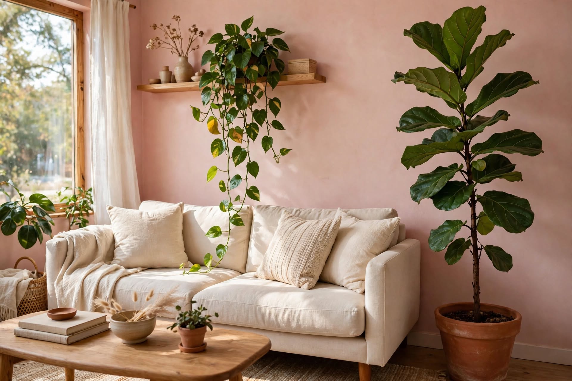

Your walls are blushing. This is not a design flaw. It might be the beginning of a very good idea.
For years, neutral living rooms followed a familiar formula: beige, gray, white, perhaps a little greige if someone felt adventurous. These colors were considered safe because they rarely demanded attention. They were the background, not the conversation.
But something has changed.
Soft pink has quietly moved beyond the accent-color category. Muted blush, dusty rose, and warm pink-beige are finding their place alongside cream, natural wood, linen, and stone. Used thoughtfully, they can create a room that feels just as calm as a traditional neutral interior, but with a little more warmth and personality.
The secret is choosing the right pink.
Not the bright, sugary shade that takes over a room. Not the pink that makes every cushion look like a birthday decoration. Think of the delicate color of a shell, a faded rose, or the warm light just before sunset.
A blush living room does not have to be dramatic. It simply needs to feel considered.
The Color That Stopped Screaming
Pink used to be an announcement. A bold statement, a playful accent, or a color chosen specifically to attract attention.
Blush pink has a different personality.
Its softer variations can behave almost like a warm neutral, especially when they contain muted beige, gray, or earthy undertones. They bring color into a room without making every other element compete for attention.
The trick is understanding that not all pinks create the same atmosphere.
Choose a blush shade that suits your room
Muted blush is a gentle, understated pink that works beautifully with cream, pale oak, and natural linen. It is a good starting point if you want color without a strong visual statement.
Dusty rose has a slightly deeper, more subdued appearance. It pairs particularly well with walnut furniture, antique-inspired details, and warm metallic finishes.
Pink beige sits between traditional beige and soft pink. It is useful when you want a room to remain neutral-looking while introducing a subtle rosy warmth.
Pale rose is lighter and airier. It can work well in rooms where you want a delicate wash of color rather than a noticeably pink interior.
Before choosing paint, test a few samples on the wall. Look at them in morning daylight, afternoon light, and after sunset. Pink can appear very different depending on the direction of the room, the surrounding colors, and the type of artificial lighting.
Four color combinations that make blush feel grown-up
- Blush pink + warm white + natural oak: An airy, Scandinavian-inspired combination that feels relaxed rather than overly sweet.
- Dusty rose + cream + walnut: A richer palette with a slightly vintage character.
- Muted pink + sage green + linen: A soft botanical combination that brings a natural element into the room.
- Blush pink + charcoal + brass: A more contemporary direction, where darker details give the pale pink a little structure.
The important thing is balance. If the walls are pink, let some of the larger pieces remain neutral. If the sofa is blush, use the walls and curtains to create a quieter background.
Pink does not need to occupy every surface to become the room’s defining color.
The Light That Knits Shadows
A blush living room depends on more than its paint color. Lighting changes how the entire palette is experienced.
A pink wall under cool, harsh lighting can look noticeably different from the same wall under a warm, softly diffused lamp. That is why lighting deserves as much attention as furniture.
Woven pendant lights are particularly attractive in this kind of interior. Rattan, wicker, and other natural woven materials introduce texture while allowing light to filter through their patterns. The result is a gentle play of shadows that makes plain walls feel more interesting.
But a beautiful pendant should not be expected to do every job.
A comfortable living room needs layers of light:
- Ambient lighting: The general illumination that makes the room usable after dark.
- Task lighting: A floor lamp beside a reading chair or a table lamp near a favorite seat.
- Accent lighting: Smaller sources that highlight artwork, shelves, or architectural details.
Choose bulbs with a warm appearance if you want to preserve the cozy character of the blush palette. The exact color temperature depends on personal preference, but warm-white lighting is usually a natural starting point for a relaxed living room.
And remember the shade itself. A fabric lampshade creates a different effect from a woven rattan pendant. One diffuses light through its material; the other can cast more noticeable patterns.
The goal is not to eliminate every shadow. It is to make the room feel comfortable at different times of the day.
A good living room should look inviting in the morning and still feel welcoming when the evening begins.
The Round Table Conspiracy
Look at the furniture in a soft pink living room and you may notice something: curves appear everywhere.
A rounded coffee table. A curved sofa. An oval mirror. A softly shaped armchair.
These forms work especially well with blush because they reinforce the gentle character of the palette. They create visual continuity without making the room feel overly coordinated.
A round coffee table can also be a practical choice in a smaller living room. Without sharp corners, it may be easier to move around, particularly when the sofa and other furniture sit close together.
However, shape alone will not make a room feel larger. Scale and placement matter just as much.
How to choose a coffee table for a blush living room
A pale oak or light natural-wood table creates a relaxed, Scandinavian look. A marble or stone-effect top introduces a more polished finish. A dark walnut table adds contrast and works particularly well with dusty rose.
If your sofa is already curved, a simple round table can echo its shape without making the room look too themed.
For a smaller space, consider a compact table with an open base or a pair of nesting tables. These can provide useful surface space without making the center of the room feel crowded.
The same principle applies to other furniture. You do not need every item to have a curved silhouette. A combination of rounded forms and a few clean, straight lines usually creates a more balanced result.
Think of it as a conversation between shapes, not a furniture collection that must follow one rule.
The Living Contrast: Plants in a Blush Room
The plants in this room are not decorations. They are roommates. They occupy corners, reach toward the windows, and occasionally drop a leaf on the rug.
And they bring something that furniture cannot: an unmistakably organic presence.
Green foliage looks especially fresh against blush pink. The contrast is gentle rather than harsh, particularly when the pink is muted and the surrounding materials are natural.
A tall fiddle-leaf fig or another suitable indoor tree can give an empty corner a focal point. Trailing plants can soften open shelving, while a small succulent or leafy plant adds a finishing touch to a coffee table.
The key is not to fill every available surface with greenery.
Instead, vary the height and placement:
- Place one taller plant near a window or in an empty corner.
- Use a smaller plant on a shelf or side table.
- Add a trailing variety where its foliage has room to hang naturally.
Choose plants according to the actual light and conditions in your room. A beautiful plant in the wrong location will quickly become a decorating problem rather than a finishing touch.
Planters also matter. Terracotta, matte ceramic, woven baskets, and natural stone finishes all complement a blush palette. For a particularly calm look, choose containers in cream, sand, or warm earthy tones.
The result should feel like a living room, not a greenhouse.
How to Build a Blush Pink Living Room Without Overdoing It
The easiest way to make blush pink feel sophisticated is to give it some breathing room.
A room where every surface is pink can quickly become visually overwhelming. A room where pink appears alongside different textures and natural materials feels more layered.
Start with a simple palette:
- One main blush shade.
- One warm neutral, such as cream or ivory.
- One natural material, such as oak, rattan, or linen.
- One contrasting accent, such as sage green, walnut, or charcoal.
Then decide where the pink should appear.
Option 1: Make the walls the main feature
If you love the idea of a pink living room, painted walls provide the most complete transformation.
Keep larger furniture pieces relatively simple. A cream sofa, pale rug, and natural wood furniture allow the wall color to become the foundation rather than one more competing element.
This approach works particularly well with muted blush and pink-beige shades.
Option 2: Choose a blush sofa
A pink sofa can become the centerpiece of a room without requiring any paint.
Pair it with warm white walls, a natural wood coffee table, and a textured neutral rug. Add a few cushions in cream, beige, or muted green rather than matching every accessory to the sofa.
This is also a practical approach for anyone who wants to experiment with the color before committing to a full room makeover.
Option 3: Introduce pink through textiles
If you prefer a quieter look, begin with smaller pieces:
- Blush cushions.
- A soft pink throw.
- Dusty rose curtains.
- A pale pink rug.
- Artwork with muted rosy tones.
Textiles are easy to change, so they offer a flexible way to test whether the color feels right in your home.
The most successful blush interiors rarely rely on one shade repeated everywhere. They use variations in tone and texture to create depth.
The Texture That Makes Pink Feel Natural
Color is only half the story. Texture is what prevents a soft pink room from looking flat.
A blush wall next to a smooth white surface can feel quite different from the same wall beside linen curtains, a wool rug, and a wooden side table.
Natural materials give the palette a more grounded character.
Linen adds a relaxed, slightly imperfect texture. It works beautifully for curtains, cushions, and upholstery.
Wool and boucle bring softness to seating and rugs. Their tactile surfaces help balance smoother materials such as painted walls or glass.
Rattan and wicker introduce visual detail through their woven patterns. They are particularly useful in rooms that need a little more warmth.
Natural wood gives the pink palette an earthy counterpoint. Pale oak keeps the room light, while walnut adds depth.
Stone and ceramic bring a quieter, more substantial texture. A stone-effect coffee table, ceramic lamp base, or handmade vase can make the room feel collected rather than overly decorated.
Try to combine materials with different finishes. A room full of smooth surfaces can feel cold, while too many heavily textured pieces can make a small space feel busy.
A little contrast is what makes the design work.
Small Blush Living Rooms: Keeping the Space Light
Soft pink can work in a small living room, but the way it is used matters.
A pale blush shade on the walls can create a gentle background without the starkness of bright white. Pair it with light flooring, a cream rug, and furniture that leaves some visible floor space.
A few practical choices can help:
- Choose furniture with legs rather than heavy pieces that sit directly on the floor.
- Use a round or oval coffee table if it makes the walking route easier.
- Keep curtains light and hang them high enough to make the windows feel generous.
- Avoid filling every wall with shelves and decorative objects.
- Use mirrors thoughtfully to reflect available light.
- Choose one or two larger decorative pieces instead of lots of tiny accessories.
A small room does not need to be entirely white to feel open. It needs a clear layout, a balanced palette, and enough visual space around the furniture.
Blush pink can be part of that balance.
The Invisible Thread
Here is the idea that ties everything together.
The blush living room is not simply about choosing pink instead of beige. It is about creating a softer relationship between color, light, shape, and texture.
The walls provide warmth. Natural wood gives the room structure. Woven lighting introduces patterned shadows. Rounded furniture makes the layout feel relaxed. Plants bring an organic contrast, while linen, wool, and ceramic finishes keep the space from looking too polished.
None of these elements needs to dominate.
That is what makes the palette so appealing. It leaves room for personality without demanding a dramatic statement.
So paint the wall if you are ready. Choose the pink sofa if it makes you happy. Add the round table, hang the woven pendant, and let a little greenery find its place by the window.
Your living room does not have to impress everyone who walks through the door.
It should feel like a place where you can finally exhale.
And sometimes, the most beautiful neutral is the one with a little blush.